Illustrator's book
Hello! I introduce myself, Nastya Lehn, illustrator for the game Quetzal, of Alexandre Garcia and Gigamic.
To briefly present the game: In charge of a group of adventurers and archaeologists, you lead all these people on a small island with forgotten temples and ruins, which you will distribute over the various sites in order to collect a maximum of artifacts and then resell them. However, you are not alone and the competitors will be happy to compete for the best locations and artifacts.
I started illustrating board games from mid-2019 and Quetzal was my 3rd game. But above all it was the first one for which I had to be in charge of all the illustrations of the game ( without an artistic director, which "stings" a bit when you're junior), and which allowed me to confront some new tasks: the creation of the cover title, tokens, meeples, interface elements and pictograms. In short, enumerating all this may be quite long, I will limit myself here mainly to the illustration work.
Following the first discussions with Mathilde and Joseph, communications manager and project manager, the first constraint was the chosen period, the 1920s, the difficulty was to avoid anachronisms as much as possible.
The cards
Illustrations
Another issue, which would mainly affect the realisation of the artefacts, was the choice of the civilization of the island: an art of Inca or Mesoamerican (Maya / Aztec) inspiration?
Note: The quetzal is a bird from Central America, but the decision to choose this animal as the symbol, mascot and title of the game was only taken late, hence the questioning of the geography, even if the island is of course fictional.
After research and comparison, Aztec and Mayan art seem more elaborate and ornate than Inca art. These different civilizations did not use the same sacrificial weapons and sometimes the references are scant or missing, such as the existence of mummies among the Aztecs or Mayas: the latter did not practice mummification, and as regards the Aztecs, I do not found only illustrations or cultural references. On the other hand, Inca examples are not lacking, due to the climate which favored conservation and the cultural practice of mummification among them.
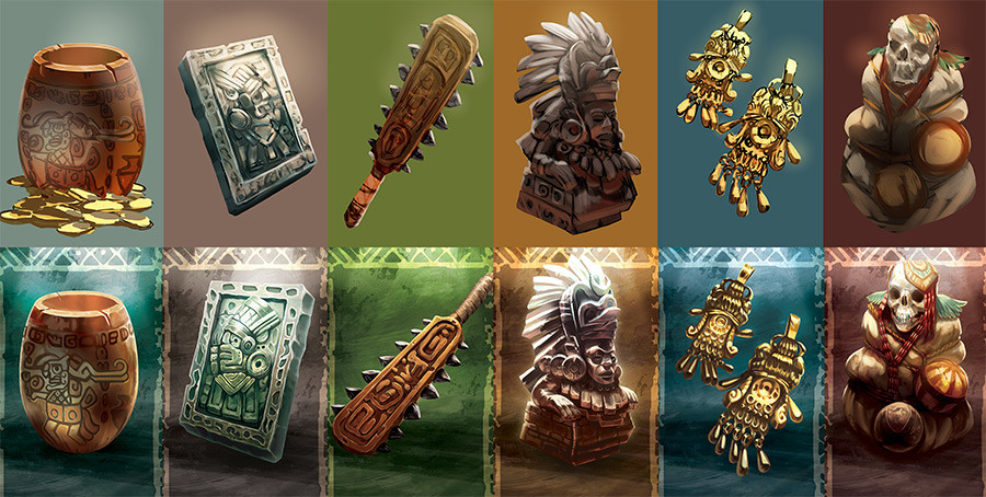
We started with a Mesoamerican inspiration, which I personally find more aesthetically interesting: a weapon like the macuahuitl (pictured above) stands out more visually than an Inca flint for example. From a geographical point of view, Mesoamerica corresponds more to the environmental setting desired by Gigamic, a paradise island with lush jungle with a coastal area.
Mathilde and Joseph have elaborate a list of artifacts and their order of value in the game, as well as 3 types of variations per item, each corresponding to a card bonus (coin, Victory points and Discovery points ).
Numerous tests followed for each element: the choice of background, colors, lighting, various bonuses. This is how the idea of incorporating a different texture in the background for each artifact was finally abandoned because it would have overloaded the image, or even bright colors would not have matched the set and the universe.
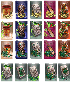
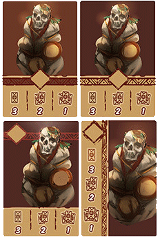
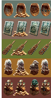
I see from his old research that the quetzal had already appeared very early in development, when researching the representations of the cards bonus / variant (2nd row of the 2nd picture). After researching, we learned about the value of cocoa nibs and beans, far more valuable than gold. In Mayan culture, quetzal feathers were used as currency. Even today, the currency of Guatemala is called the Quetzal in reference to this time and this animal.
The board
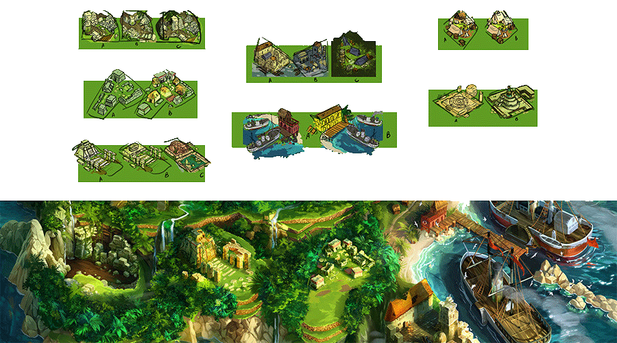
The different locations & the temple
The plateau is divided into two parts, an upper part to collect artefacts, with the temple, the most important site to collect artefacts and which dominates the rest of the island, and a lower part, to resell them or buy upgrades, and an camp in between.
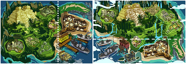
The excavation sites, being mainly ruins and blocks of stone (only the temple should be the best preserved), I tried to distinguish them by different shapes. The black market had to be isolated from the rest and remind its clandestine nature, a camp hidden in the jungle, or a small abandoned fort for example.
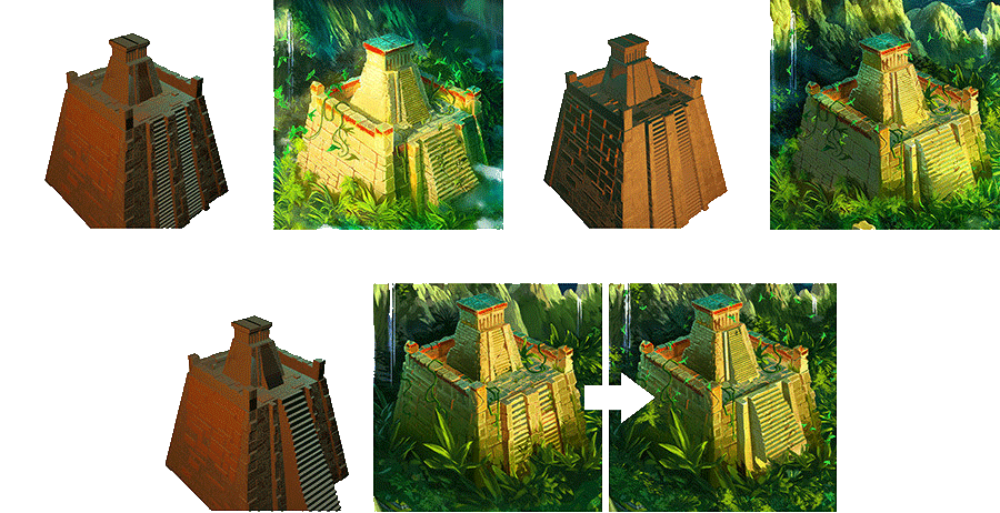
A redesign of the temple was necessary because it ended up "smothered" between the game track and the interface, once the cards were placed on the board. It was necessary to break the horizontality of all these elements with a more vertical temple.

The set and the cover were going to be intrinsically linked: from the start, Gigamic team had envisioned highlighting the island and its temple on the cover. It could not therefore be started before the plateau was sufficiently advanced. The temple was going to be painted twice and any modification to one would necessarily impact the other. Despite not being very comfortable with modeling nor fond of using 3D as a medium at the time, the deadline was approaching, I finally made the decision to create the temple in 3D, which is then revealed as a lifesaver in the face of some unforeseen events and corrections.
From the first meeting, Mathilde and Joseph had rightly predicted a rather trying task. The board was indeed the biggest workload and the biggest source of difficulties. Not only it was a large surface to paint but it was necessary to make sure to take into account the space for the tracks, the location of the cards or the meeples, to go back and forth between the illustrative and graphic part, to edit and correct.
Its very large dimensions were particularly painful for my workstation and its poor 8 GB of RAM, devoured greedily by Photoshop, to the point of requiring the board to be split into several files. I learned from this experience that I needed to invest a minimum of 16 GB and ideally 32 GB for this type of mission.
Characters
Illustrations & meeples
The Gigamic team wanted characters from all walks of life and from different professions, to be able to stand out from each other and thus offer more choices to players, so some research had to be done upstream on dress fashion and personalities from the beginning of the 20th century. This is how we were able to draw inspiration from people like Rafael Larco Hoyle or Julio Tello, Peruvian archaeologists, Bessie Coleman, American aviator, Toshiko Yuasa, Japanese physicist, Marga d'Andurain, French adventurer, and Domenica Walter, collector of French works of art.
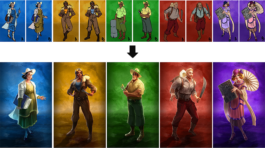
Each character then had to be represented with accessories in reference to their profession and have distinct postures and expressions to give them different personalities. To my surprise, the first tests were immediately validated and I was able to quickly move this part of the work forward. The next step was to adapt the characters to meeples, this time on Illustrator.
For those who did not know, this software allows you to create vector images, which have the advantage of being infinitely resizable without altering the image. We had to synthesize the characters into the simplest shapes possible and add bleed to anticipate print offsets, very likely for such small pieces.

Cover
Game concepts & title
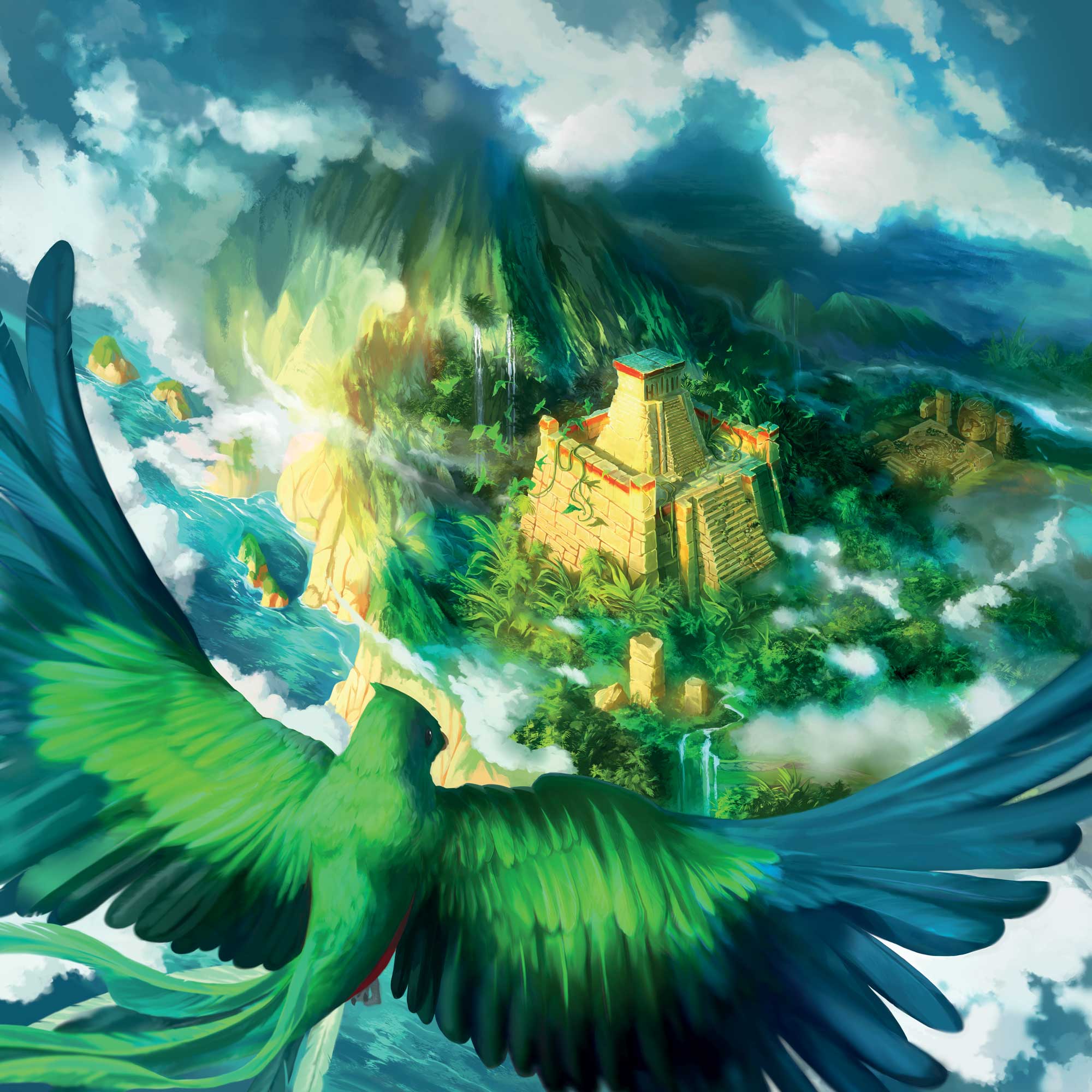
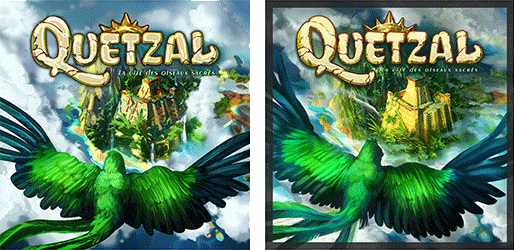
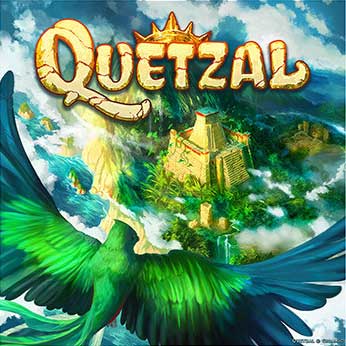
Unlike many other projects where cover is requested as a priority, this one particularity has been its late completion. As mentioned at the start, the title of the game was under consideration and tentatively named "Toboggan". The Gigamic team had from the start had an aerial view of the island in mind, from a biplane, and wanted to avoid the classic cover of adventurers in front of a temple.

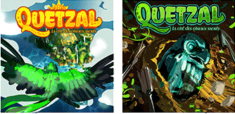
I did a few drafts but quickly had to move on to other tasks. Subsequently, they announced to me the choice of the title "Quetzal", a reminder of its sacred la nature and its great value in Mesoamerican cultures. Two diametrically opposed concepts came out: the first approaching the very first idea of the team, an aerial view emphasizing the environment, and which would later become the cover of the game, and the second, a big shot of a representation of a half-unearthed quetzal, referring to excavation of artefacts.


It was not intended that I would take care of the title of the cover at first, then after discussion, we agreed that I would continue the research. I did some tests with different fonts, took the idea of the rising sun from the first drafts to give a Mesoamerican touch with the cult of the sun, and use the most characteristic feature of the quetzal, its very long tail, on the letter Q.
Tokens
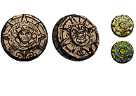
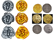

Another little novelty for me: the creation of tokens and small game tiles. Again, some research was necessary, although overall this task was one of the simplest and fastest.

Its difficulty lay in creating the bleed and managing the safety margin (in case of offset cutting), since these parts would be cut later after cutting shapes made by the graphic designers at Gigamic.

Conclusion?
Quetzal was a very dense and complete project that taught me a lot, both on Mesoamerican cultures and on the methodology, as well as technical points. I would associate this experience a little with an enthusiastic jump in the large basin, without a buoy, when you barely know how to swim: So yes, you may have underestimated the depth a little bit, yes, you may have being a little drunk at one point, but in the end you have the satisfaction and experience of having done so.
Thanks for reading this journal, hope you enjoyed it. :)
